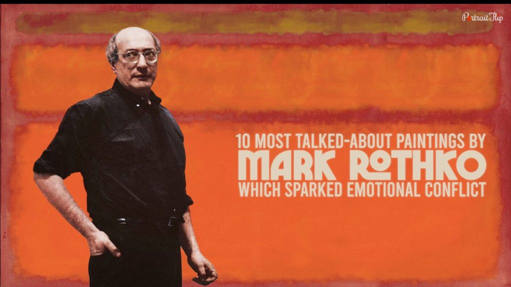
Step into the world of Mark Rothko, a pioneer of Abstract Expressionism, where color and form merge to create transformative experiences. In this article, we delve into the profound artistry of Rothko and explore the impact of his monumental canvases. From the scale of his works to the interplay of light and shadow, we embark on a journey to understand the power and transcendence within Rothko’s art.
The Artistic Vision of Mark Rothko
Mark Rothko’s artistic vision sought to evoke profound emotional responses through the use of color and form. His iconic style involved large, rectangular canvases with layered blocks of vibrant colors. Rothko believed that color had the ability to elicit deep, spiritual sensations, and his paintings were intended to envelop viewers and transport them to a realm beyond the physical world.
The Impact of Scale
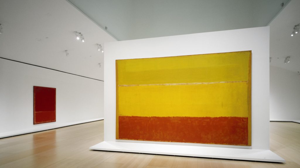
One of the defining characteristics of Rothko’s art is the monumental scale of his canvases. By creating large works, often spanning entire walls, Rothko aimed to immerse viewers in an overwhelming sensory experience. The sheer size of his paintings allows viewers to be enveloped by color, inviting them to lose themselves in the depths of the canvas and to engage on a visceral level.
The Intimacy of Half Light
While Rothko’s works are often associated with their monumental scale, the interplay of light and shadow is equally vital to his artistic vision. Rothko carefully considered the lighting conditions in which his paintings would be displayed. He believed that the ambiance of half light, where the paintings are neither fully illuminated nor completely in darkness, created an intimate and contemplative atmosphere that enhanced the emotional impact of his art.
The Emotional Language of Color
Color was the primary language through which Rothko expressed his emotions. He carefully selected hues and juxtaposed them to create harmonious or contrasting effects, evoking different emotional responses. Rothko’s color choices were not arbitrary; rather, they were carefully calibrated to resonate with viewers on a subconscious level, evoking a range of emotions from tranquility to awe.
Rothko’s Chapel: A Sacred Space
One of the most significant manifestations of Rothko’s vision is the Rothko Chapel in Houston, Texas. Designed as a place for contemplation and meditation, the chapel houses a series of his large-scale paintings. The dimly lit space, with benches for quiet reflection, allows visitors to engage with Rothko’s art in an environment specifically tailored to enhance the spiritual and emotional experience.
Rothko’s Enduring Legacy
Mark Rothko’s legacy as an artist extends far beyond his lifetime. His profound exploration of color, scale, and emotional expression continues to captivate and inspire audiences today. His works have influenced subsequent generations of artists, and his contributions to Abstract Expressionism have left an indelible mark on the art world.
Mark Rothko’s use of color in his art differed from other Abstract Expressionist artists in several key ways. While he was part of the broader movement, Rothko developed a unique approach to color that set him apart from his contemporaries. Here are some ways in which Rothko’s use of color differed:
Color as Emotion: Rothko believed that color had the power to evoke deep emotional responses in viewers. His use of color was not merely decorative or representational; it was intended to convey a sense of spirituality and transcendence. Rothko sought to create an emotional resonance through his color choices, aiming to elicit profound sensations and connections with the viewer’s inner self.
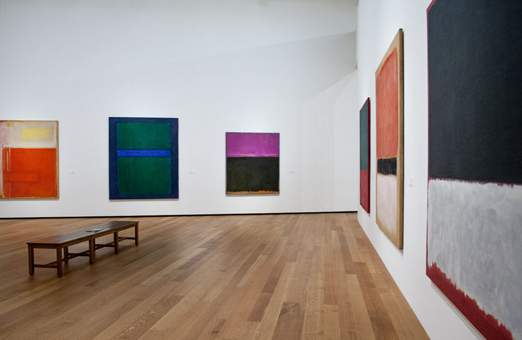
Evocative Color Fields: Rothko is famous for his large, rectangular canvases filled with expansive color fields. He often used broad, flat areas of color that seemed to hover on the canvas, creating an immersive and enveloping effect. Unlike other Abstract Expressionists who may have used color in a more gestural or expressive manner, Rothko’s approach was more restrained and focused on the contemplative power of color itself.

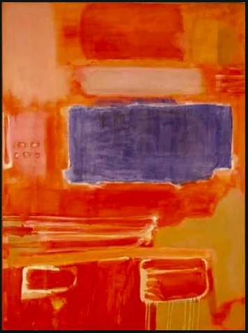
Layering and Transparency: Rothko frequently employed a technique of layering multiple thin washes of paint on his canvases. This created a sense of depth and luminosity, as the underlying layers would subtly shine through the surface. The transparency of his colors allowed for a nuanced interplay of light and shadow, enhancing the emotional impact of his works.
Color Harmonies: Rothko carefully considered the relationships between colors in his compositions. He was known for his sophisticated color harmonies, exploring how different hues interacted and influenced one another. Rothko juxtaposed colors to create harmonious or contrasting effects, aiming to evoke specific emotional responses from the viewer. His mastery of color relationships added an additional layer of complexity and depth to his works.
Diminished Palette: While some Abstract Expressionists embraced a wide range of colors and expressive brushwork, Rothko often worked with a more limited palette. He frequently focused on a select few colors in his paintings, allowing their intensity and luminosity to take center stage. This restraint allowed for a heightened concentration on the emotional impact of individual colors and their interaction within the composition.
Mark Rothko’s art transcends conventional boundaries, inviting viewers into a realm of sublime experience. Through the interplay of scale and light, the emotional language of color, and the creation of sacred spaces, Rothko’s art resonates with audiences on a profound level. As we navigate the immersive world of Rothko’s canvases, we are reminded of the power of art to transcend the physical and connect with the deepest recesses of our souls.